
TCS BaNCS
In December of 2015, I was hired on to the FutureCore project as a Senior UX Designer. The project was created to replace Zions Bank’s core banking software. This core transformation has been previously attempted by many major national banks without success. In July of 2017 Zions released phase one, and in February 2019 Zions release phase two of their core banking softaware overhaul.
A note about this case study: This project is under NDA for the life of the product. Screenshots, wireframes, and prototypes of the application are not available.
Why Take the Risk?
To fully service our customers, the bank’s workflow required
employees to access multiple applications throughout the day. Most of these applications have separate logins
and dramatically different usability.
Many of these applications required outdated hardware and operating systems to function. This reason
alone would force the bank to upgrade their core software in the next few years.

In a business where speed is key, multiple logins and lengthy load times is a massive pain point.
Our Team
The original team consisted of one UX designer and 3 BAs. I
was hired along with another UX designer to create three Designer/BA teams. Each team was given one or more
areas of the application to research, design, test, and implement.
I created a pattern library that was used as building blocks to keep the look and feel consistent across the
application. As teams were focused on different areas of the application, a lot of the research and
usability challenges were unique to each team.
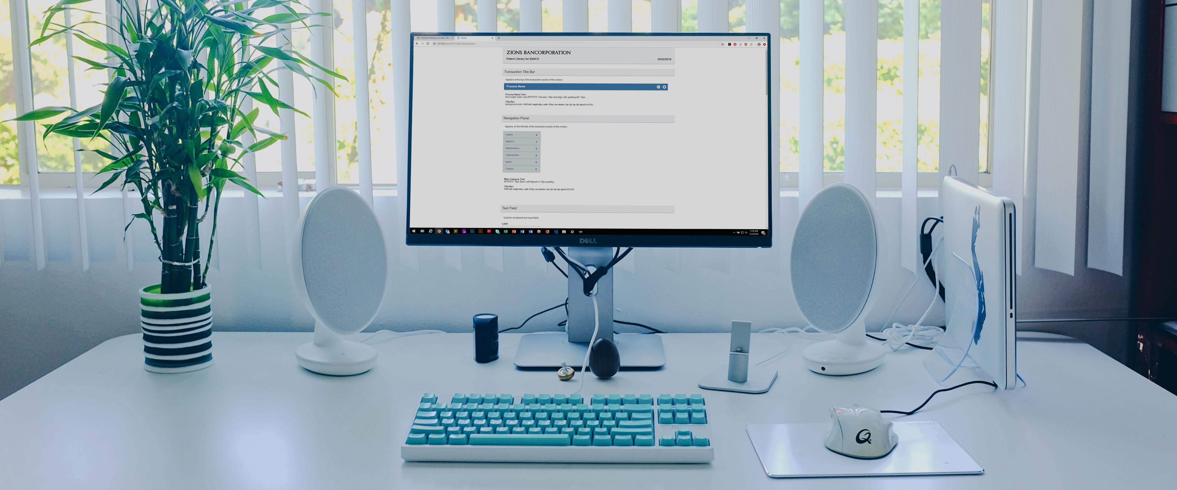
The biggest difficulty working in a segmented environment was keeping consistent usability throughout the application.
The New "Out of the Box" Application
The application purchased to replace Zion's core banking
software was not as ready for the US market as we believed. The user experience was designed for a drastically
different market in places like Dubai, India, and various European markets. A full analysis of their current
user experience was needed to assess the gaps and discrepancies with our user base and business
requirements.
Upon initial review, it became evident that their users were mostly mouse-based and very process driven. Many
of the day-to-day account processing activities were offloaded to the user to keep response time in the system
to an acceptable level.
Many of the modules required for the US market were missing from the application. The Teller module is used by
about eight percent of our user base was not coded or even designed. These modules needed to be researched,
and requirements written, prior to any design creation. Luckily Zions stores vast amounts of data regarding
current usability and metrics.
Hardware limitations were very evident in the design of the application. Offloading processing to the user as a work around to software limitations should be avoided at all costs.
Data Gathering and Application Assessment
I begin the design process by interviewing Subject Matter Experts and users to define pain points and possible gaps in the application. Many of these interviews were conducted onsite to properly observe the day-to-day duties and assess environmental pain points.
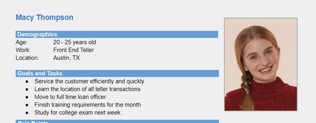
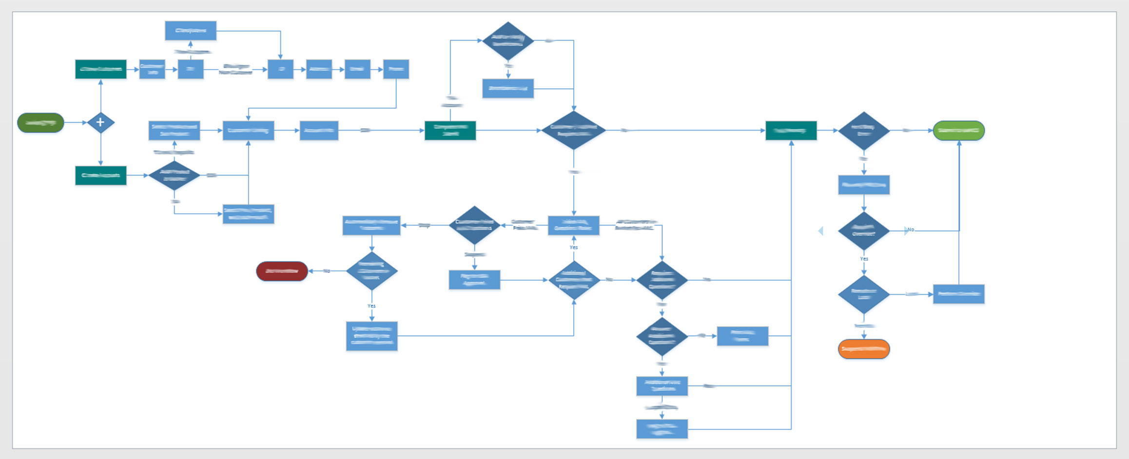
I used the data gathered from these interviews to create personas, user stories, and process flows that assist in properly defining the problem to be solved.
The Business Analyst on my team worked in tandem with Subject Matter Experts to acquire technical data and create business requirements needed to address stakeholders needs and compliance with state and federal regulations. We then reviewed the designs to ensure technical standards were met prior to review with the stakeholders.
Design Phase
Utilizing the gathered data, I created multiple wireframes
showing proposed solutions for the new screen. The wireframes and data were taken to the subject matter
experts and various end users for an in-depth review. Once the initial review was complete, I redesigned and
updated the wireframes based on their feedback. This iterative cycle continued until I believed we were solid
enough on the solution to begin user testing.
Using wireframes and functional prototypes, I conducted weekly user tests to verfiy assumptions or
problematic areas of the screen. These tests ranged from A-B Testing to functional prototype walkthroughs
depending on the necessary requirements.
A year into the project my user testing style drastically changed after attending a FRONT UX conference. I switched from a monthly to a weekly testing cycle thanks to a class by Andrew Branch.
User Testing
Recently my user testing methodology changed from a large scale
monthly moderated testing schedule. My team now performs weekly unmoderated tests to quickly answer questions
and iterate through design decisions. The speed and effeciency of weekly unmoderated testing more than makes
up for the loss of personal interaction with the user.
Most of my testing on BaNCS revolved around the "Time to Complete" metric. In the bank's branches our users
are servicing hundreds of customers per day. Something as small as a 4-5 second load time drastically
increased frustration with the application. Every effort was made to streamline data entry and field
comprehension to decrease our user's time to complete.
Having full unfettered access to our actual user base has been the saving grace of this project.
Testing and iterating during each sprint allowed us to
streamline each screen as much as possible. Once each pain point had been resolved to a satisfactory level, a
functional specification was created and sent offshore for development.
When a code drop was received from our developers offshore, it was reviewed and tested again in our onsite
lab. Users were brought in and allowed to run through their daily activities. Using these user acceptance
sessions, I was able to assess if the solution properly addressed the user's pain points and allowed them to
meet their goals.
The BaNCS Application
TCS BaNCS is an internal application used for processing
day-to-day transactions in a financial institution. It supplies the back end, interfacing, reporting, and the
front-end GUI. Our users are all employees of the company, but the speed and usability of the software
directly affects our customers.
As our users are all employees and the application is extremely vast, there is expected to be training on the
software prior to use. Our product design efforts have greatly decreased the amount of training required as
well as reduced the time to complete a transaction by over two minutes.

Even a 10 second increase in our Time to Complete metric adds a new pain point that is directly felt by our employees and customers.
Conclusion
As the project is still under development, I can only sum up
my experience so far.
User testing is a MUST! If you’re not user testing prior to release, you’ll be user testing after at a much
higher cost. I believe many of the roadblocks we've encountered during this project would have been found if
the product would have been fully user tested earlier in the development cycle. Every application can be
improved through user testing. Product design is smilar to art in that it is never finished, only abandoned.
Working with offshore developers can be difficult at times due to scheduling and communication, but is still a
viable solution.
This project has been an extremely difficult and fulfilling learning experience. I believe I have grown almost
as much as a product designer during the three years on this project as I did during the eleven years I spent
designing at Evelyn.