KeepnTrack
KeepnTrack started life as a glorified spreadsheet application
used for tracking volunteer hours. The application was purchased by COMPanion Corp with the plan of
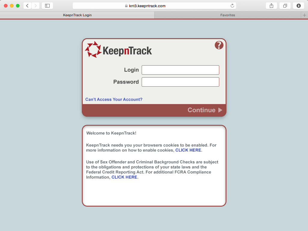
redesigning and integrating it into our ecosystem. The version delivered to us was already a cloud-based
applicaiton, however, its front end was quite limited and out dated.
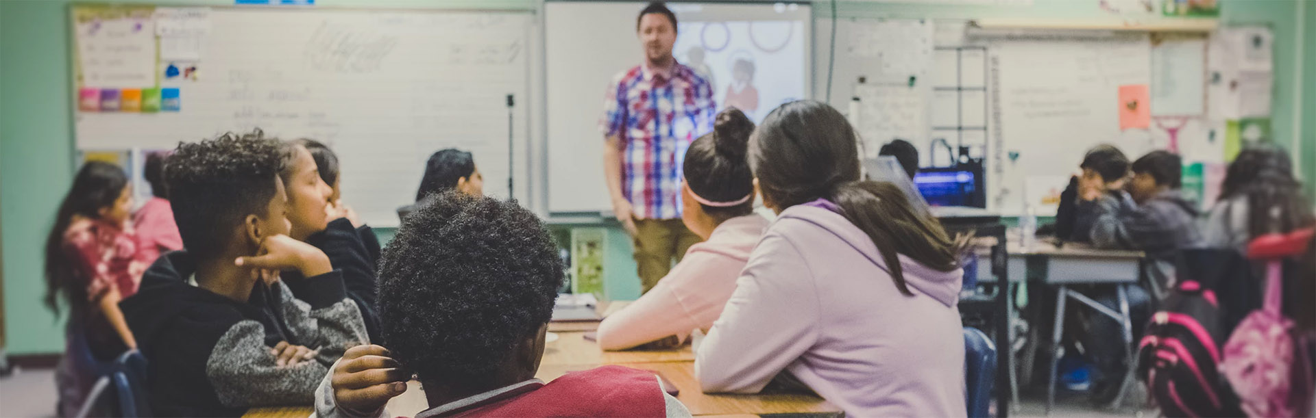
Although KeepnTrack was also a K-12 application, its target audience was completely different from what we
were used to with Alexandria. The userbase of KeepnTrack was mainly administration and security officials.
Speed and ease of use were by far the most important metrics to track during development.
Two of the KeepnTrack developers stayed on the project after it was purchased. This would be my first
experience in working with off-site developers. Although they were quick to respond and readily available, an
off-site development team still added a bit of complexity to the project.
Software aimed at the security and safety of children adds an extra layer of importance to a project.
Understanding the Users
Unlike Alexandria, we had no existing data on the userbase for
KeepnTrack. I knew the users were generally administration officials or security officers, but user data
needed to be gathered. I started by sending out surveys and questionnairs to each school district currently
running KeepnTrack.
I was able to gather enough data to create four distinct personas representing the userbase. These personas
were basic and full of assumptions, but they were a good start and would be refined during the design process.
These personas were mainly used to keep the design discussions user centric and promote empathy in the
room.
As an exercise, we used KeepnTrack at the office for a week in order to get a real feel of the pain points and
usability of the current application. Each day a different employee was tasked with running the checkpoint and
documenting their experience. Even though it was run on a small scale and with somewhat bias users, this
exercise yeilded some interesting insights into the usability of the application.
Next I moved onto learning about our direct competitors and their offerings. Our main competitor in the K-12
space was an application developed by a single person out of Florida. This application had a rather large
customer base for its features and limitations. My initial summary was that a properly designed and tested
application would thrive in this market.
The full user journey should be mapped along with the flow through the application. Many times there are aspects of the full journey that directly influence the user's experience with the application.
Redesigning the User Journey
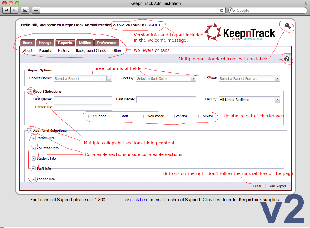
Looking at the current state user journey, it was
relatively easy to pinpoint the areas that required the most attention. The flow through KeepnTrack was
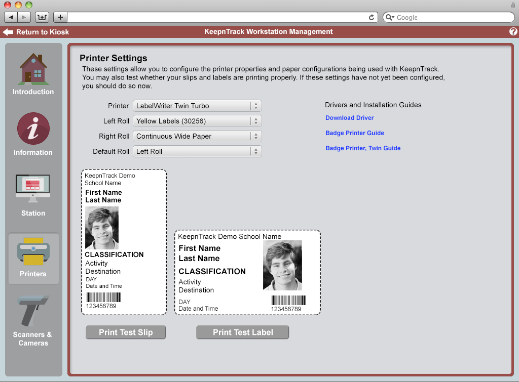
only a part of the full user journey. Badge printers, ID Scanners, interfacing with security equipment, and
sending notifications all needed to be addressed in order to ensure a quick and seamless experience.
My initial step was to remove everything that wasn't necessary to complete a basic check in and check out.
This allowed me to refine the flow of the application and create a strong core of the user flow. Each aspect
of the journey was then dissected and analyzed to ensure necessary functionality was not lost in the redesign
process. Analytic data was reviewed to determine the features that should be required for the MVP. The initial
release needed to provide all of the features that were utilized in the current offering.
Simplification of the navigation in KeepnTrack was integral to user-centered design approach.
Navigation was the most difficult part of the KeepnTrack
redesign. It was imperitive during this stage to avoid making assumptions based on the relatively minimal
amount of user data available. In order to remedy this problem, I sent out click tests and held card sorting
activities trying to determine the optimal path through the application. These activities were invaluable in
determining placement and functionality of features in KeepnTrack. Many of our assumptions during this phase
were proven incorrect and needed to be redesigned to fit the customer's needs.
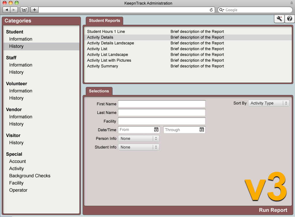
Once navigation through the application had been nailed down, asthetics and animation were defined and high
fidelity prototypes were created to simulate a full user experience with KeepnTrack. Usability tests were
performed with the new prototype to further refine the design. Each element had to support scaling between
mobile, ipad, and desktop environments as well as skinning to allow for customization. Many of the current
customers required the ability to insert their school logo and colors into the application. An interface to
facilitate this customization was designed and tested along with the application.
UX Design is often confused with UI Design. Although similar in name, UX is about the journey while the UI contains the tools and elements required to navigate the path.
The Refinement Cycle
Starting the design from a minimum viable product has the added
benefit of allowing development to begin early on in the process. The core of the application was solid
and the back end was already in place. As each area of the design was completed, it was sent to the
development team for production and testing. This rapid development cycle had a major impact on user
acceptance.
As new features were designed and developed, the MVP was out in the wild being used and feedback gathered. The
low severity of bugs, and turnaround time on fixes was so short that user satisfaction skyrocketed. Each
new release brought requested features and fixes to an already successful and thriving product.
Keeping the full user journey in mind, third party hardware such as badge printers, ID Scanners, and RFID
gateways were brought in and tested to refine the full user experience. Each peripheral was chosen based on
features that lined up with our core philosphy of speed and ease of use. Features of the application were
modified or redesigned to take full advantage of the hardware's capabilities. This comprehensive empathic
philosophy enabled us to create a seamless experience that will empower users for years to come.
Test early and test often. As a project matures, the cost of making changes is drastically increased.
The Wrap Up
As the design backlog shrank, I was moved on to the next
project. Development continued but was also whittled down to a small team to fix minor issues and develop
any remaining features.
The new version of KeepnTrack was now the most polished, advanced, and feature rich K-12 personel tracking
product on the market. By the time I was moved to the next project, KeepnTrack had already surpassed our
competitors in sales, userbase, and approval ratings.
This project was a great introduction to an agile style development schedule. Although it wasn't a true agile
project, the ability to quickly respond to customer and developer feedback was incredible.